Most yard sign orders go wrong in the same quiet way: the size gets chosen by habit or by price, not by where the sign will stand or who has to read it. A sign that is perfect on a front lawn disappears at a busy intersection, and a jumbo panel meant for a highway corner is a waste of money stapled to a picket fence. The good news is that the decision is not really about taste. It comes down to two things you can measure — how far away your reader is, and how tall your biggest word needs to be — and once you know those, the size almost picks itself.
The four sizes that cover almost every job
Yard signs cluster around a handful of dimensions, and four of them handle the overwhelming majority of orders. 12 by 18 inches is the small, close-range size: directional arrows, “Parking,” “Check-in this way,” open-house pointers — anything read from a sidewalk or a driveway with only a word or two on it. 18 by 24 inches is the standard, and it earns that title; it is the practical default for campaign lawns, real estate listings, local services, events, and hiring signs, with room for a name, a line of service, and a phone number. 24 by 36 inches steps up when 18 by 24 feels lost on the property — large yards, corner lots, business entrances, or a message that needs a headline plus a disclaimer. Above that sit the oversized 4-foot formats such as 4 by 8 feet, which give billboard-style reach for a few strategic anchor placements rather than broad distribution. Real estate riders, the narrow 6 by 24-inch strips that clip onto a post to add “Sold” or an agent’s name, round out the set.
The rule that actually chooses the size
Sign professionals lean on a simple relationship between letter height and reading distance: roughly every inch of letter height buys about ten feet of comfortable reading distance. Two-inch letters read cleanly from around twenty feet, which suits a sidewalk. Four-inch letters carry to about forty feet, the distance from a front lawn to a passing car. Six-inch letters reach roughly sixty feet, which is what a set-back house or a corner lot needs. The chart below traces that line.
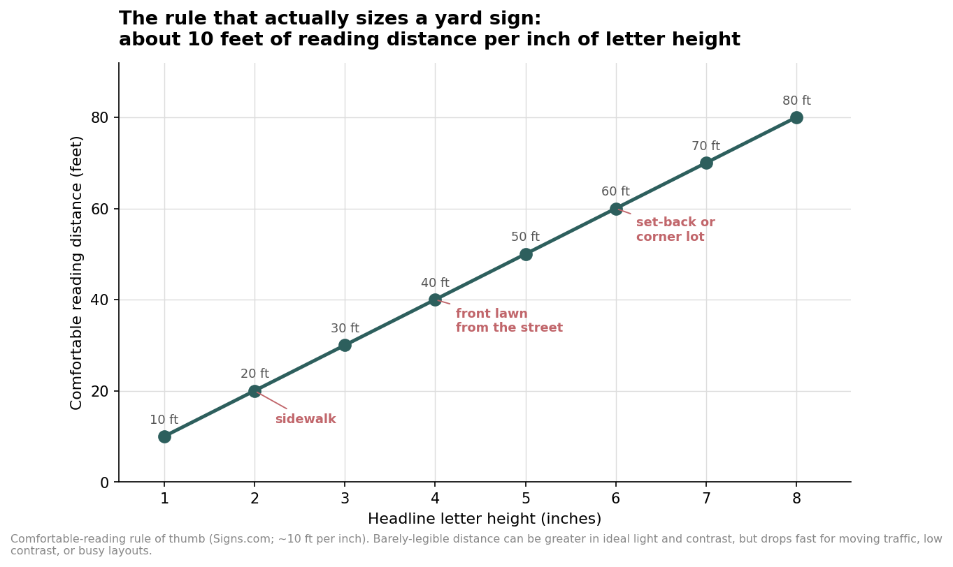
Two honest caveats keep this from becoming a trap. The “ten feet per inch” figure is for comfortable reading; a letter can be just barely legible from farther away in ideal light with strong contrast, but that margin collapses the moment the reader is moving, the contrast is weak, or the sign is crowded with extra lines. And the number is driven by your largest word. If the headline is legible but the phone number underneath is half the height, plan the sign around the phone number, because that is the line people actually need when they are ready to act.
Working backward from the sign to its size
Because letter height is capped by the physical panel, size and reach travel together. Fit the biggest headline a given size can carry — a rough guide is letters about one-sixth of the sign’s short dimension, leaving room for the rest of the copy — and each size lands at a predictable range.
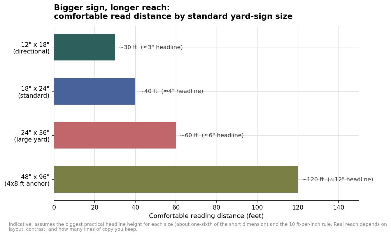
Read that against your placement and the answer is usually obvious. A real estate sign viewed from the street wants 18 by 24 or, on a deep lot, 24 by 36, with a rider for status. A political or campaign lawn sign is the textbook 18 by 24; the money is better spent on more of them in more yards than on a handful of giants. Event and directional signage splits between 12 by 18 for the up-close arrows and 18 by 24 for the main entrance. A business or grand-opening message on a busy road is where 24 by 36 or a 4 by 8-foot panel finally earns its cost, because the reader is farther away and moving faster.
Where the sign stands changes the answer
The same message needs a different size depending on the ground it sits on. A sign flat against a sidewalk is read from ten or fifteen feet, so 12 by 18 with a short line is plenty. Push it to the middle of a lawn and the nearest reader is now thirty or forty feet back on the street, which is 18 by 24 territory. Put it on a corner lot where cars approach at an angle and slow down only briefly, and you need both more height and fewer words — 24 by 36 with a three or four-word headline beats a cluttered standard sign every time. Speed matters too: a driver at 35 miles per hour has a second or two, so the faster the road, the larger the letters and the shorter the copy.
Buying in bulk without over-ordering
For a bulk run, the trap is buying one size for everything. Most campaigns and rollouts are better served by a mix: a large volume of the standard 18 by 24 for broad placement, a smaller count of 24 by 36 for anchor corners and high-traffic spots, and a modest set of 12 by 18 for directional duty on the day. Decide single- versus double-sided by traffic flow, not reflex — a sign seen from both directions on a through street or a median genuinely needs two printed faces, while one pressed against a building or facing a single approach does not, and printing the back you will never show is pure waste. The oversized 4-foot panels are the easiest place to overspend, so treat them as a few deliberate placements rather than a default. Size each sign to its reader and its spot, order the mix that matches where the signs will actually stand, and the same budget covers far more ground.